Pages

Jan 31, 2011

GF2 at DxOmark (+ DxO analysys by Van Den Hammer)

GF2 at DxOmark (+ DxO analysys by Van Den Hammer): "


We already knew it and DxOmark confirms it. According to DxoMark there is virtually no difference between the GF2 and GF1 RAW image quality. Color depth, dynamic range and ISO performance are exactly on par. By far more worth to read is the article written by Peter van den Hamer and posted on Luminous Landscape. Peter explains how DxOmark works and how reliable it is: “Probably every image quality expert would have a somewhat different personal preference for a benchmark like this. But my impression is that the benchmark is pretty useful: I analyzed the model and the data, but didn’t find any serious flaws.


He gives many hints about how DxOmarks works and one was particularly interesting: “It should be clear by now that larger sensors (rather than larger pixels!) can produce less noisy images. This is simply because a larger sensor area can capture more light – and for reasonable resolutions this is pretty independent of the amount of MPixels the sensor’s surface has been divided into.


Click on the store name to directly check price and availability of the GF2: Amazon US , Adorama, BHphoto, Amazon UK, Amazon DE and eBay.

"

Jan 27, 2011

Black and white in Lightroom

Black and white in Lightroom: "

opener.jpg


Most of us know we can convert and image to black and white in Lightroom by simply pressing the letter V. However, for the exact same image, your version of Lightroom might give a very different result to my version of Lightroom. The explanation is that there are two settings available for black and white conversions in Lightroom.


I’ll show you what these are, how to configure the one you want to use and how to quickly switch between them.


Lightroom_black_and_white_step1.jpg


With a color image on the screen in Lightroom’s Develop module, press the letter V to convert it to black and white.


Open the B&W panel – it’s called Greyscale in Lightroom 2 – and check out the color sliders.


Lightroom_black_and_white_step1a.jpg


Depending on the preferences that you have set, the sliders might all be set to zero or they might show a black and white adjustment tailored to the image itself which Lightroom calls Auto mix.


The auto mix adjustment applies an auto exposure adjustment to the image as well as a conversion that maximizes the distribution of the grey tones in the image. This is customized for the image so every image will be given a custom adjustment much as you will get if you click the Auto Tone button in the Basic panel. Notice the subtle differences in the histograms in each of the adjustments here.


Lightroom_black_and_white_step2.jpg


Whether or not you see this Auto mix applied to a black and white image is controlled by your Lightroom preferences. To see these, choose Edit > Preferences (or Lightroom > Preferences on the Mac), select the Presets tab and there’s an option there which reads “Apply auto tone mix when first converting to black and white”.


If this is checked you will get the auto tone mix applied to the image, if not, you will see a black and white adjustment where each color is given the same adjustment value of zero.


Lightroom_black_and_white_step3.jpg


Regardless of which setting is in place you can switch between the two in the B&W panel.


If an Auto mix has been applied, hold the Alt key (Option on the Mac) and you will see an option Reset Black and White Mix. Click this and all the sliders will be set back to zero.


Lightroom_black_and_white_step4.jpg


On the other hand, if your sliders are all set at zero, click Auto to apply the auto mix adjustment to the black and white image.


Lightroom_black_and_white_step5.jpg


You can further adjust the black and white regardless of whether you have an auto mix applied automatically to it or not by adjusting the sliders.


You can also select the Target Adjustment Tool and drag on an area of the image to adjust whether it is light or dark. Dragging downwards will darken it, dragging upwards will lighten it.


Post from: Digital Photography School


"

Gold Award from Dpreview for the Olympus XZ-1!

Gold Award from Dpreview for the Olympus XZ-1!: "


Excellent news for Olympus! Dpreview tested the new Olympus XZ-1 and gave the camera the GOLD AWARD! That’s what they say: “The XZ-1 combines simple direct controls with an excellent lens to create probably the best photographers’ compact currently available.

A few days ago Dpreview tested the Canon S95, the Panasonic LX5 and the Nikon P7000. The XZ-1 beats all of them!


Read the review and after that preorder the camera at Amazon US, Adorama, BHphoto, Amazon DE, Amazon UK ;)

"

Jan 13, 2011

Aperture vs. Photoshop in B&W Post Production: More Notes From Scott

Aperture vs. Photoshop in B&W Post Production: More Notes From Scott: "
Aperture Finished File

Aperture Finished File


Photoshop Finished File

Photoshop Finished File


——–

Note: NO, we didn’t have too much eggnog and accidentally re-publish a post from just before the holidays… We did, however, get a TON of reader requests from a lot of y’all who are using less and less Photoshop, and asked Scott if he could get similar results in Aperture or Lightroom. Short answer is YES. To that end, Scotty re-worked this image using Aperture and wanted to share his process with you here. Take it away Scott!

——-


Update: I just heard that this black & white work from Seattle 100 was just featured today in Communication Arts! I’m a huge fan of Comm Arts… very humbled and very stoked. Please check it out here. [thx Lou Maxon!]

—-

The above file on the left was processed entirely in Aperture. The above file on the right is the Photoshop version that we discussed before the holidays. One can certainly nitpick to find details that are different between the two, I know I did, but that would be missing the point.


Speaking of the point, let me get to it. These two images were processed with different RAW algorithms, retouched, adjusted, smooth, and sharpened with different tools with different abilities and nuances. People will rant and rave ad nauseum online about the differences between software offerings. Yet despite all of the obvious discrepancies between the Aperture and Photoshop methods, the net result is very much the same. The vision is important, the method is not. Join me after the jump to learn more.


Lest I come off ungrateful, let me make clear that I love the tools. Photoshop is a brilliant program that has literally set the bar. Aperture has more features packed in than ever though possible even a couple of years ago, and continues to encroach on ground that has historically been squarely in Adobe’s court while providing usability and integration that is absolutely groundbreaking. These two, and a number of other programs offer the photographer and retoucher a set of tools that provide almost limitless possibilities. These are fun times.


In the spirit of sharing and transparency, I’d like to run through the process that I went through in Aperture in order to create the final image, as long as y’all promise not to get too caught up in the details.


Original DNG in Aperture

Original DNG in Aperture


Step 1. Light cosmetic retouching with retouch brush and skin smoothing brush.

Step 1. Light cosmetic retouching with retouch brush and skin smoothing brush.


Step 2. Converted to black and white using the Aperture Black and White tool.

Step 2. Converted to black and white using the Aperture Black and White tool.


Step 3. Curves to increase overall contrast.

Step 3. Curves to increase overall contrast.


Step 4. Curves brushed in to increase brightness in her eyes.

Step 4. Curves brushed in to increase brightness in her eyes.


Step 5. Levels to darken shadows and midtones while maintaining bright highlights.

Step 5. Levels to darken shadows and midtones while maintaining bright highlights.


Step 6. Levels to push whites in exterior areas to bright white.

Step 6. Levels to push whites in exterior areas to bright white.


Step 7. Highlights and Shadows tool brushed in to increase hair texture.

Step 7. Highlights and Shadows tool brushed in to increase hair texture.


Step 8. More of the same with the Highlights and Shadows tool.

Step 8. More of the same with the Highlights and Shadows tool.


Step 9. A little dodging brush in the eyes, a light vignette to keep the hair on the far edges from blowing out, and some moderate sharpening with the sharpen tool.

Step 9. A little dodging brush in the eyes, a light vignette to keep the hair on the far edges from blowing out, and some moderate sharpening with the sharpen tool.


That’s it. Cool, eh? Let’s all go forth and play. Any software, any hardware. Just bring your creativity, it’s all you need.


BTW, if you haven’t seen the snazzy Seattle 100 site developed by our friends at TheSuperformula, there are about 900 more B&W images, plus a whole lot more. Check it out here and click around a little–it’s not to be missed. Happy New Year! -Scott


"

Jan 9, 2011

How to Determine the Total Number of Shutter Actuations on Your Camera Using Photoshop

How to Determine the Total Number of Shutter Actuations on Your Camera Using Photoshop: "

Determining shutter count  in PhotoshopHere's a handy tip... Ever want to find out how many photos you've taken with your camera? I've always been asked about the total shutter count (shutter actuations) whenever I've tried to sell a digital camera, and also wanted to know the answer whenever I look to buy a used camera. In general, knowing how many times the shutter has fired on your camera is a pretty handy piece of information to know since it tells you a lot about how much usage the camera has actually had.


The number of shutter actuations can be easily be determined if you shoot in the RAW format (which for Nikon cameras means files with a .NEF extension). The shutter actuation count is incremented and stored in each NEF file and can be accessed via a few different EXIF readers, as well as by Photoshop if you know where to look! Here's a quick how-to on how to access this data.


Shutter Actuations with Photoshop CS4


Photoshop CS4 view


Shutter actuations with Photoshop CS5


Photoshop CS5 view

"

Jan 5, 2011

How to Create a Custom Calendar in Lightroom

How to Create a Custom Calendar in Lightroom: "

Calendars_opener.jpg


One feature that I (along with a lot of other users) would like to see built into Lightroom is a calendar template. Unfortunately, there is not one available but thanks to Jerry Courvoisier of www.lightroomworkshops.com, for 2011 at least, you can download and create CD jewel case calendars for 2011.


Calendars_step1.jpg


To get started visit http://www.lightroomworkshops.com/tutorials.html and download the large zip file which contains everything that you need. It’s called Calendars for Custom Print Module and it works with Lightroom 3 only.


The zip file contains not only the print presets for creating the calendar pages but also the calendar images and a movie that explains how to get everything working.


Once you’ve downloaded the file, unzip its contents and open up Lightroom.


Calendars_step2.jpg


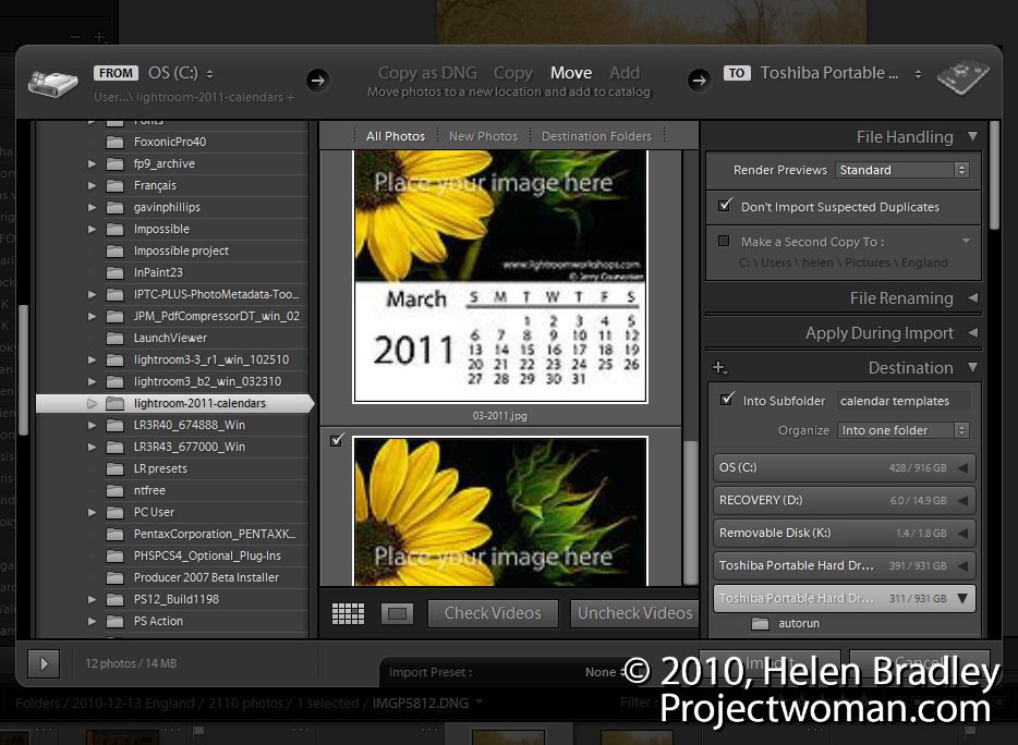
Start by importing the 12 jpeg calendar images into Lightroom. Choose File > Import Photos and browse to locate your downloads folder and the Lightroom 2011 Calendar subfolder that the files will have been unzipped into.


Select all twelve calendar pages, create a folder for them inside Lightroom and import them.


Calendars_step3.jpg


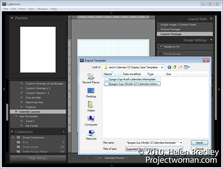
Open the Print module. Locate and open the Template Browser panel and right click the Lightroom Templates folder. Click New Folder and create a folder for the calendar page layouts – CD Calendar Layouts is a good name to use. Right click this folder, choose Import and go ahead and import the two .lrtemplate files from the package of unzipped files.


Calendars_step4.jpg


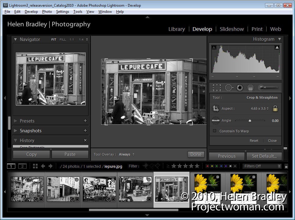
Switch to the Library module and create a new collection containing all the 12 calendar page images you just imported and 12 images to use for your calendar. Each image should be cropped using the Crop tool in the Develop Module tools to a size of 4.65 in wide by 3.5 in tall. (In his video Courvoisier suggests you crop to 4 x 3 but the actual cell sizes used are 4.65 x 3.5in). You can create a custom crop size to use.


Calendars_step5.jpg


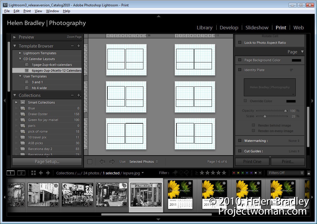
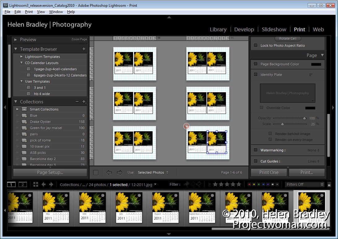
With the collection selected, return to the Print module, click Page Setup and set the paper to Letter, Landscape orientation.


Select the 6pages-2up-24cells-12calendars template.


Calendars_step6.jpg


To create the pages, drag and drop one calendar page into each of the larger picture placeholders in the template. If the page doesn’t into the right box, select Edit > Undo and try again. You’ll need to have the calendar pages in position before placing the images into the pages.


Calendars_step7.jpg


Now drag and drop the images into the smaller image placeholders for each calendar page.


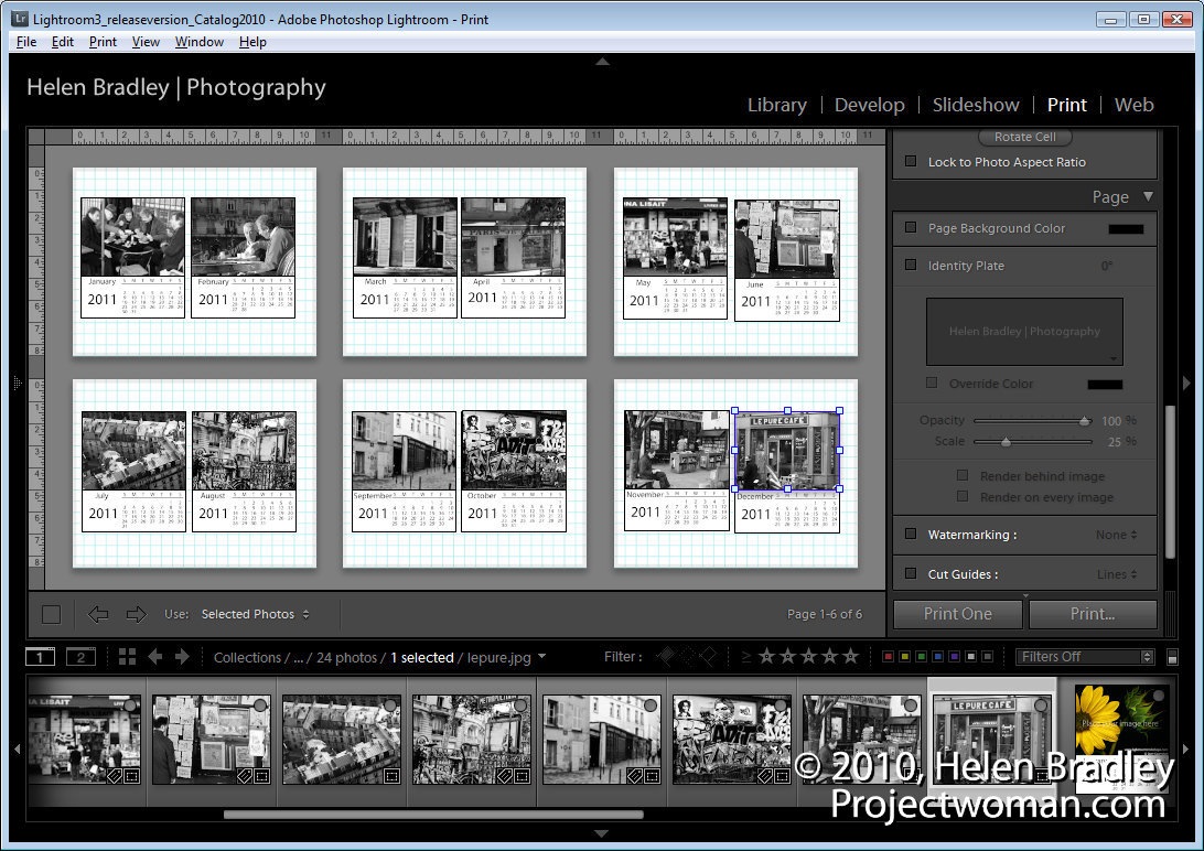
Once you’ve assembled the pages it’s simply a case of printing them using the print options and them assemble the pages by trimming them to size and placing the images inside a CD case.


You can reverse engineer the project to create your own calendar pages at any size. To do this, you’ll need to create a calendar in a program such as Photoshop and save it as a high quality JPG image. This will become the basic calendar page and over the top of that you can insert your calendar image. For a one month to a page you’ll need 12 calendar pages or you can create a full year calendar on a page with space for an image. Better still, if you have access to a program that will create the calendars for you and that lets you save the pages as jpeg or png images – use that. Microsoft Publisher is one such program that would work.


Post from: Digital Photography School


"